MIT’s Office of Sustainability and CommonWealthKitchen developed an exciting food product: the Field Fritter. It’s local, environmentally-friendly, and delicious. It also wasn’t yet widely known. To get campus dining programs to opt in, they had to get the word out, showing chefs why the Field Fritter should be on their menus and how they should use it.
They wrote the playbook. We made it shine.
Design
Field Fritter Playbook

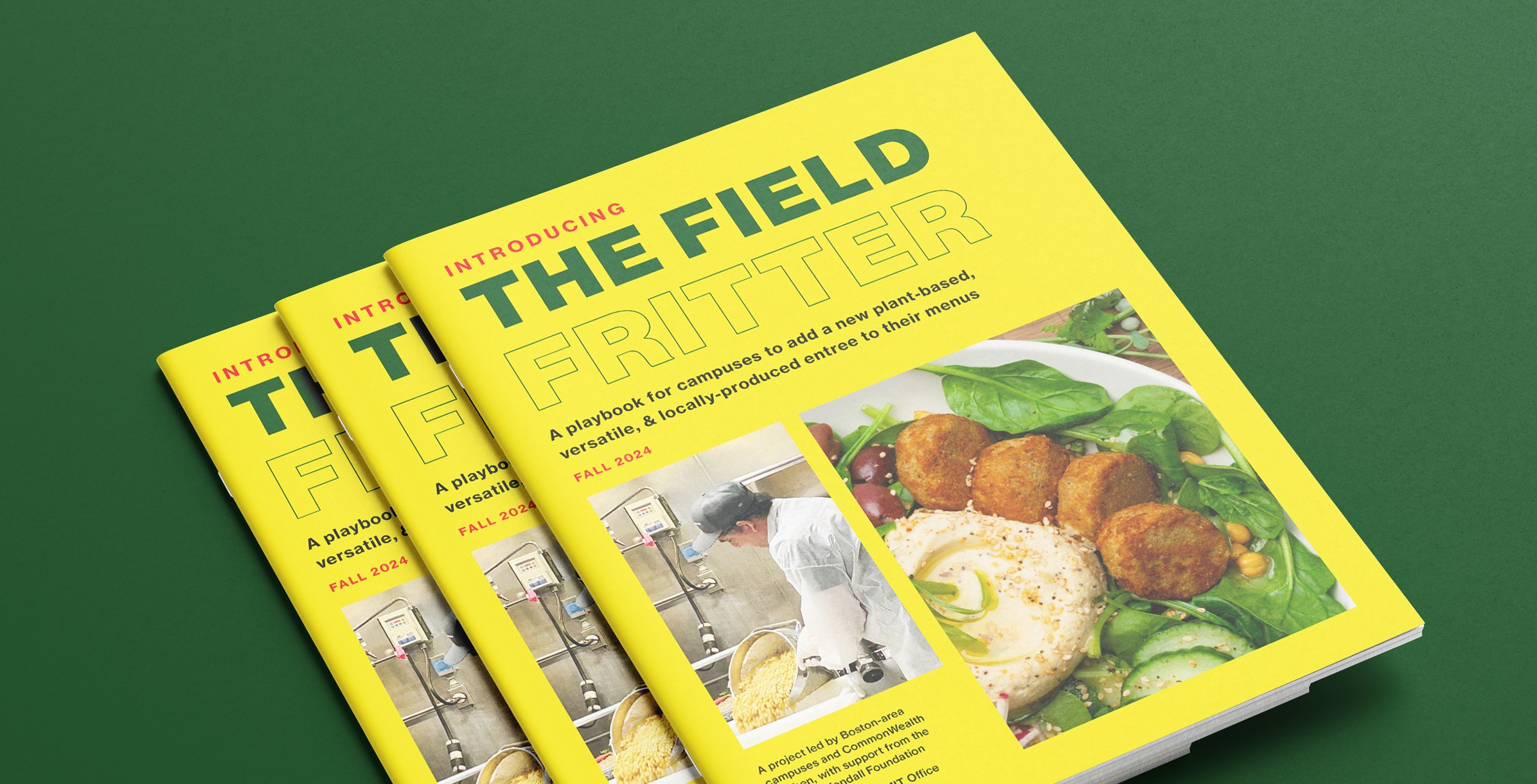
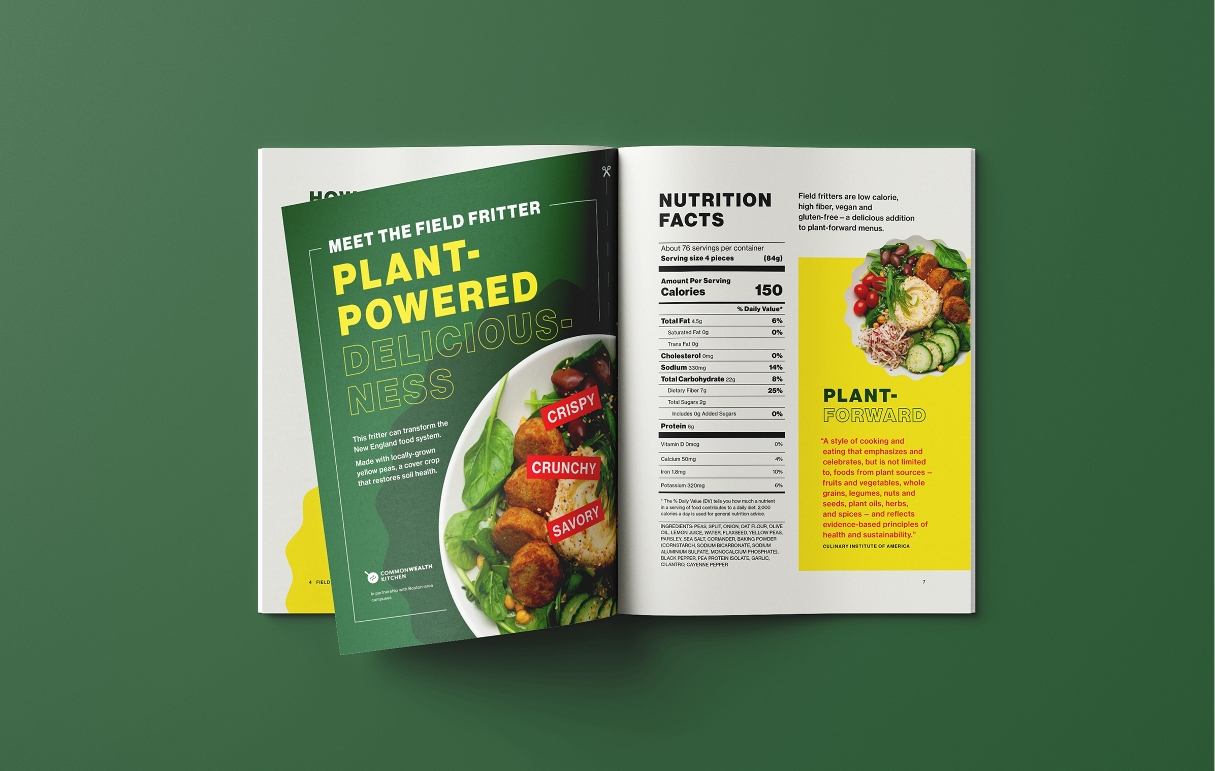
A Field Fritter is a crispy, delicious, protein-packed bite that can be used in tons of different ways. It’s made from Maine-grown yellow peas. It’s easy to use and cook. But it’s not always easy to get people on board with the unfamiliar.
That meant the playbook had to demystify the Field Fritter. To do that, we brought brightness to both the color palette and photography to highlight the possibilities with the Field Fritter, removing some of the mystery behind this new product.
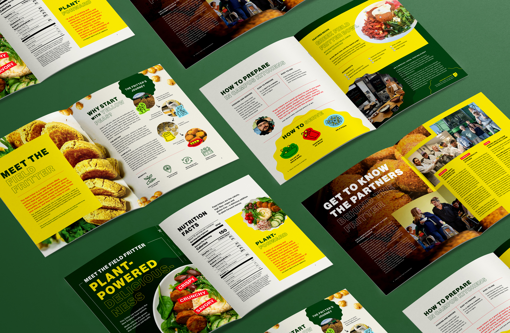
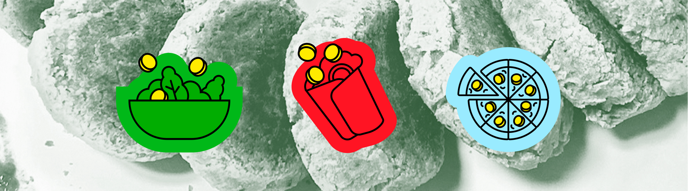
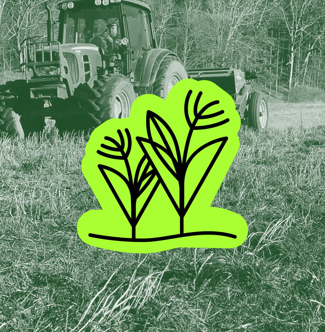
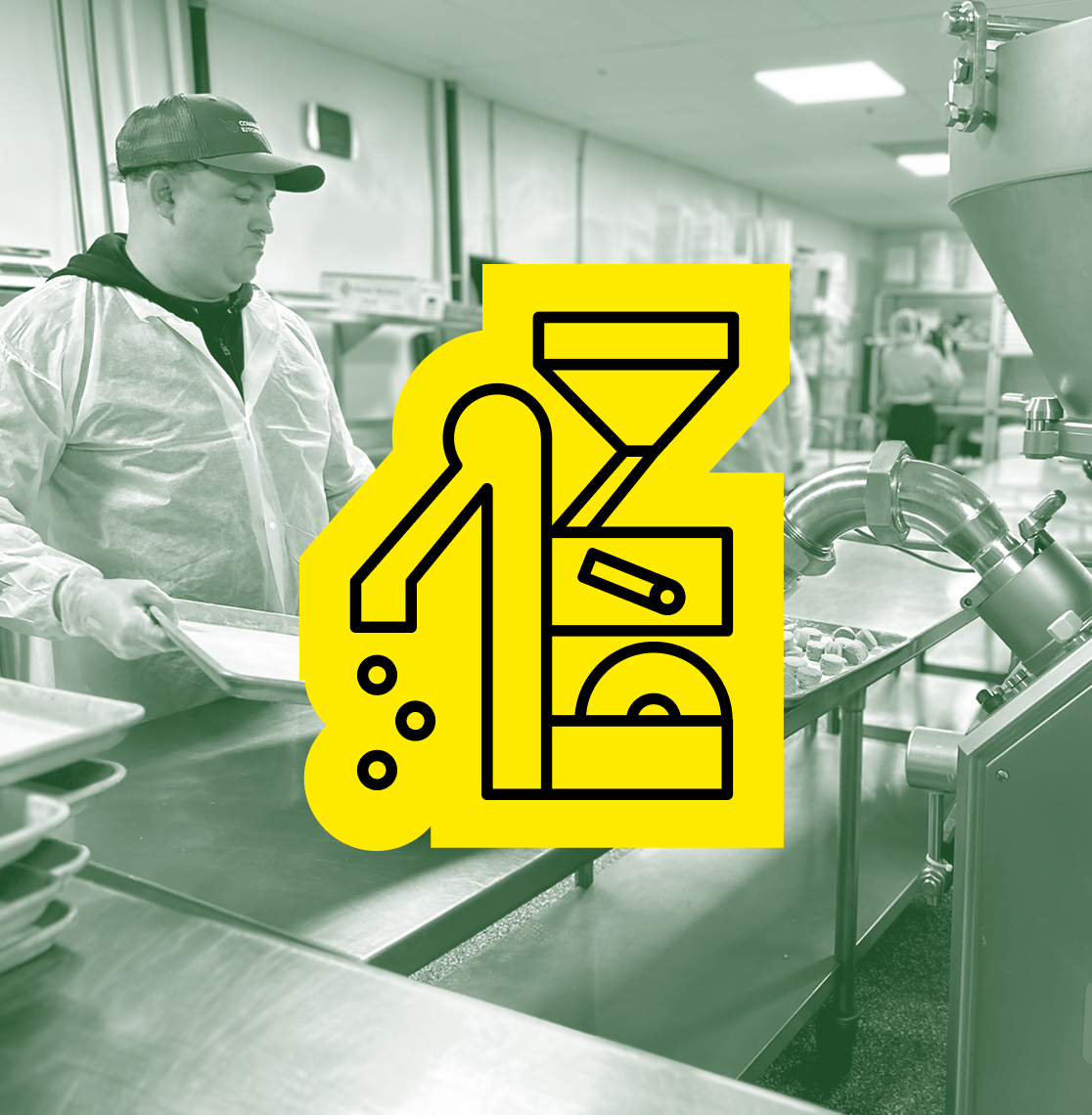
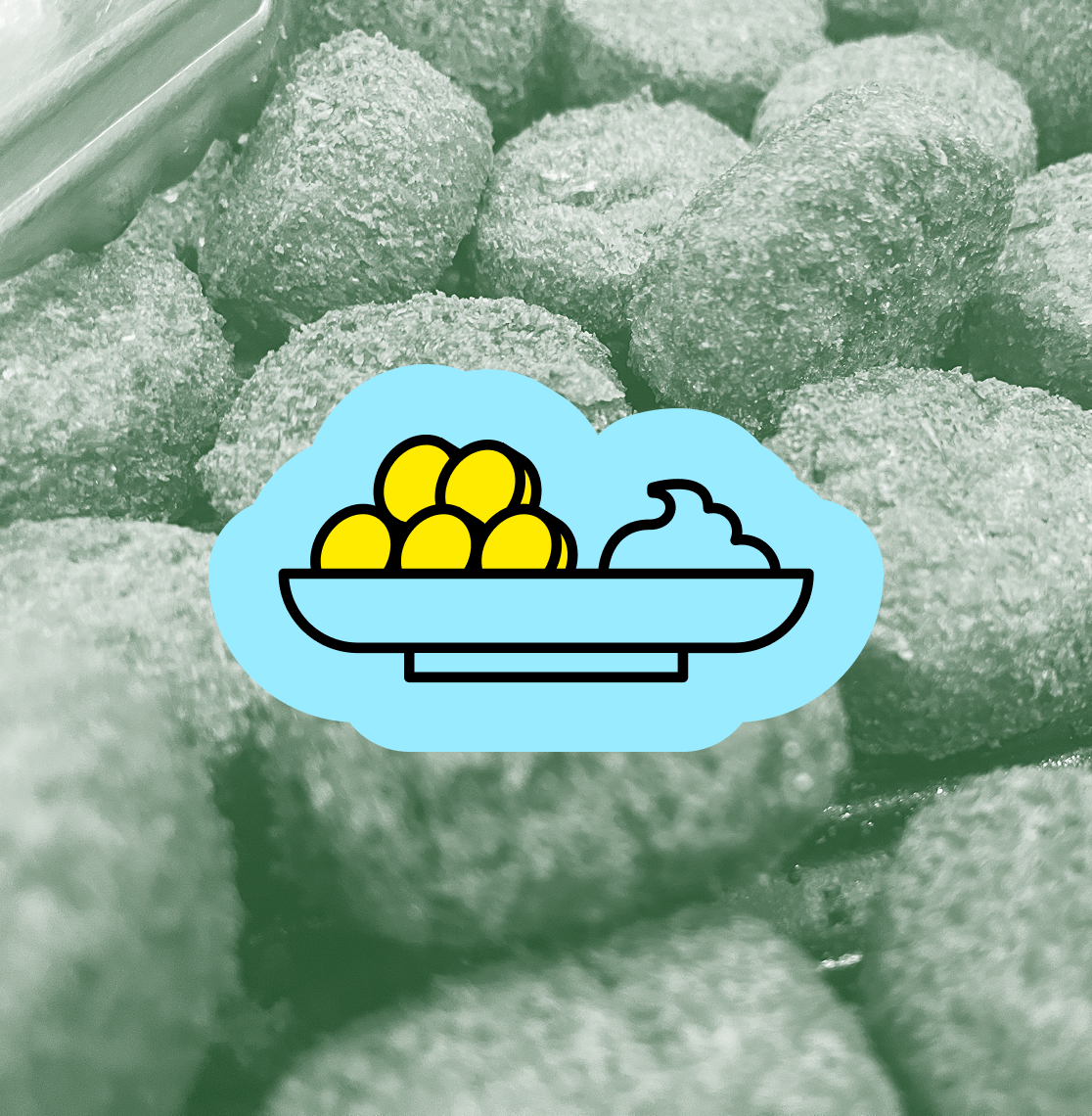
After thinking about how to remove some of the mystery, we also had to think about how to add visual interest to the playbook. We created cheerful, hand-drawn icons to accompany the photography about the fritter’s journey from farm to fork. The icons are inspired by food stickers and labels, and their appearances throughout the playbook made this new product that much more approachable.
The playbook is striking in PDF form, but it’s also print-friendly. It includes a printable poster within the playbook that chefs could feature when the Field Fritter is on the menu. Vibrant photography of the Field Fritter in action (i.e., on the plate) and eye-catching typography aim to grab students’ attention and create new fans on campuses throughout New England.
Proud to be a certified women-owned business
Proud to be a certified women-owned business
Proud to be a certified women-owned business