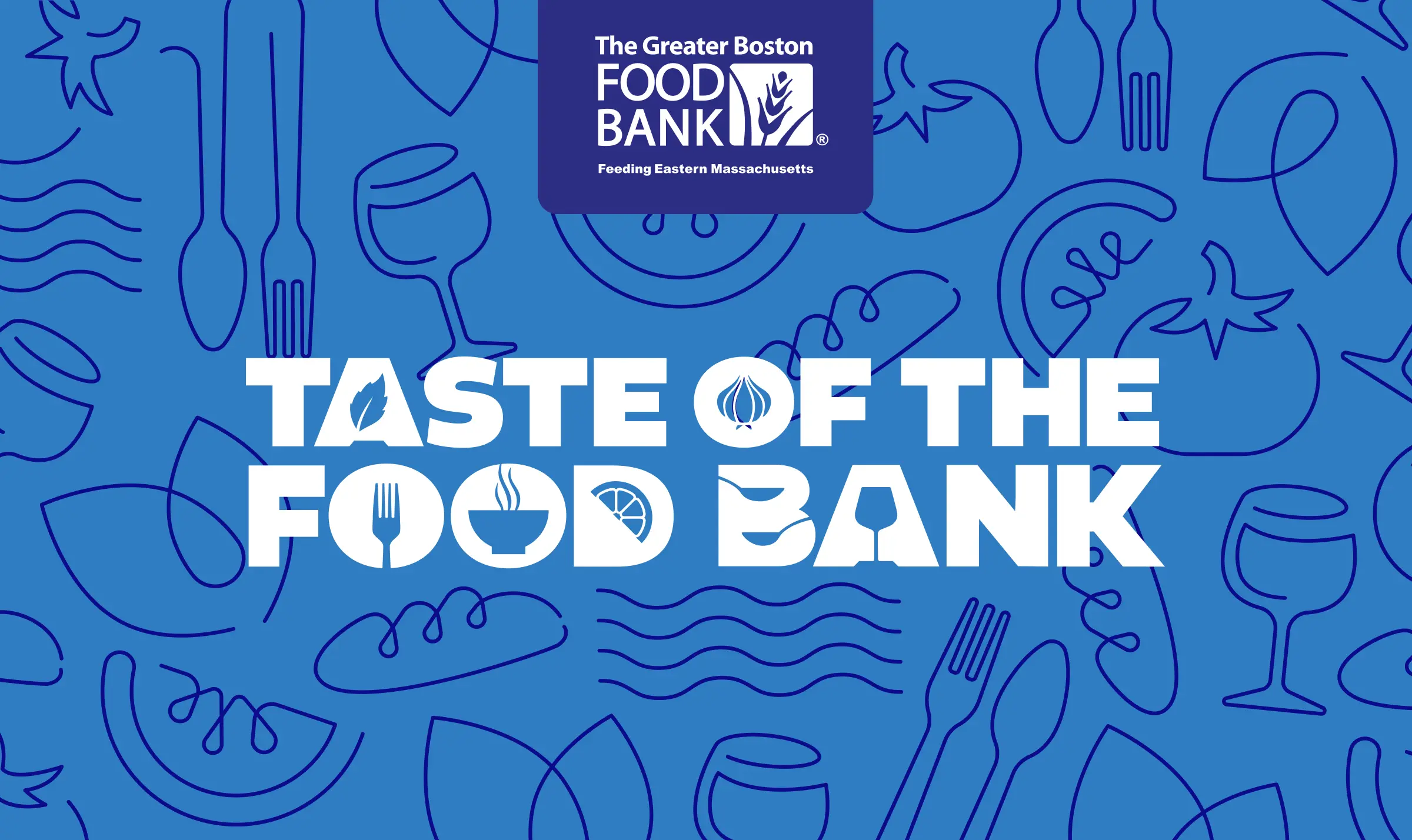
Taste of the Food Bank is one of The Greater Boston Food Bank’s (GBFB) premier fundraising events. This mix of amazing chefs, mixologists, and foodies comes together each year to sample delicious bites and raise funds to end hunger in eastern Massachusetts.
And of course, you can’t have a premier event without a premium look and feel.
Design
Event Branding
Invitations
Signage
Event Program
Digital Marketing Assets
Promotional Materials
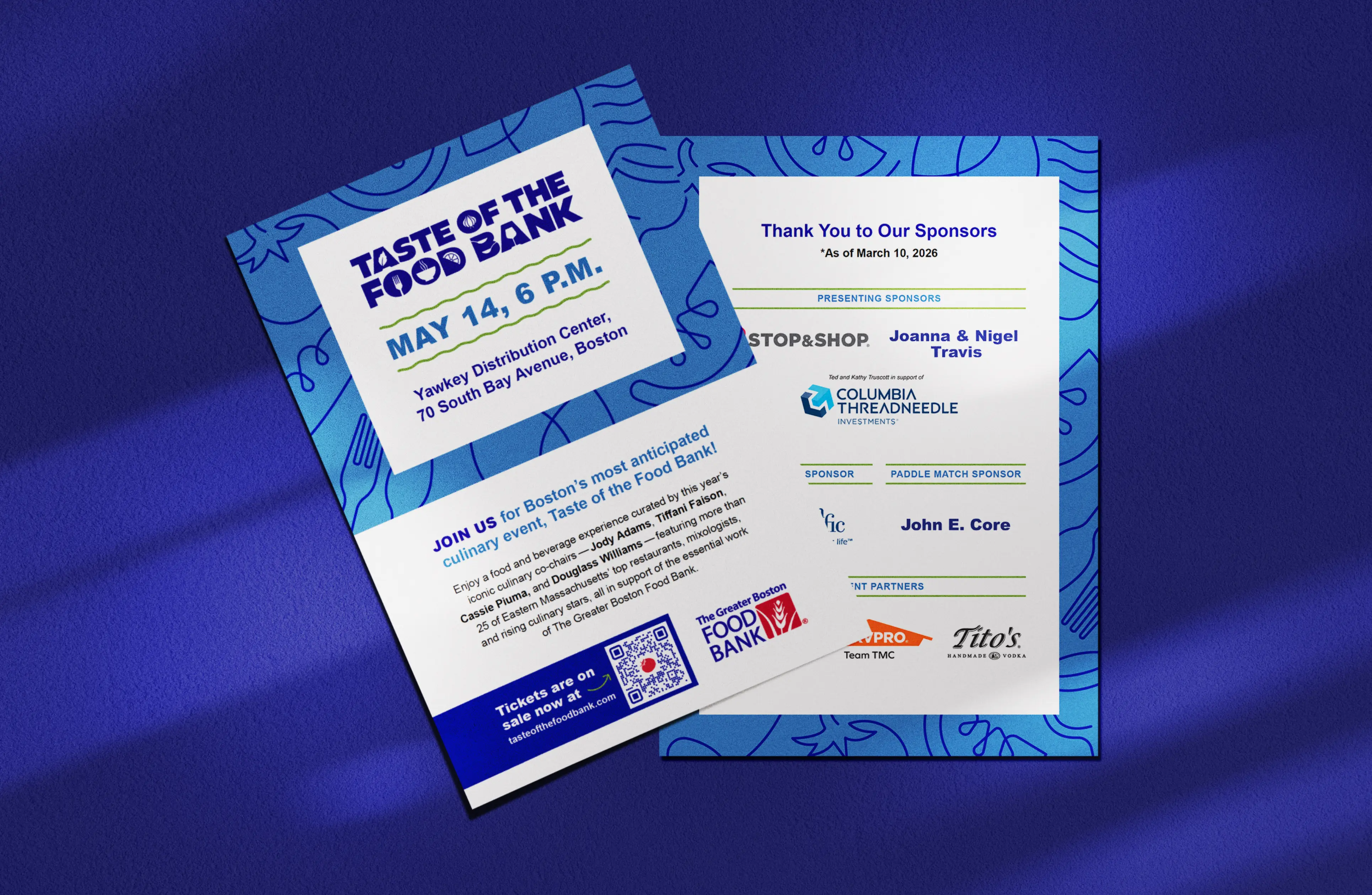
An event like this requires a lot of assets that’ll make an impression, both for pre-event promotion and actual day-of items. We knew our look and feel approach had to live comfortably across many different deliverables and within GBFB’s brand guidelines and color palette. With those parameters in mind, we got to work.
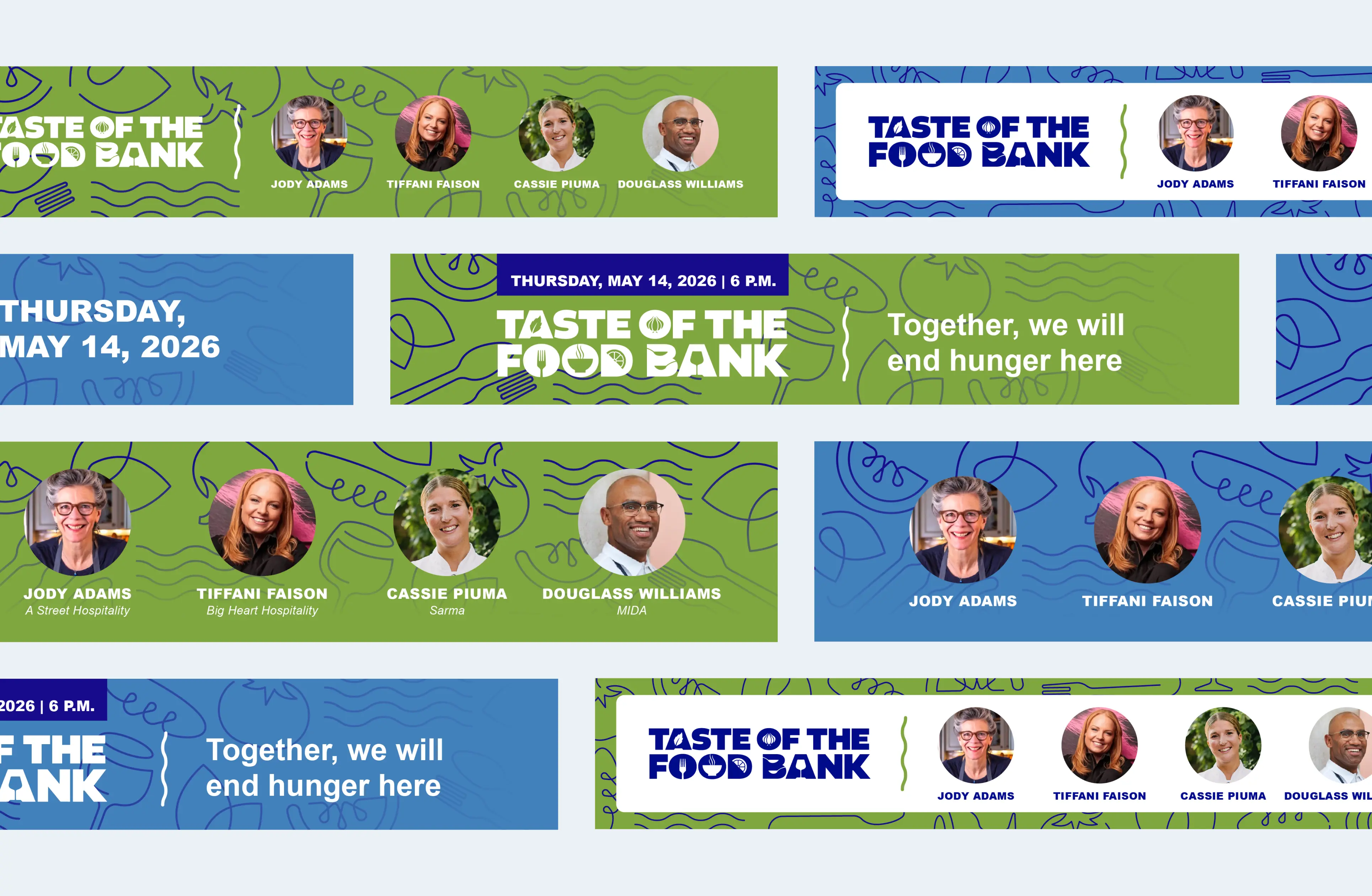
The event design in past years was approachable and slightly playful, which made sense for an event that’s more James Beard than Michelin. After a couple of iterations, we landed on a simple, slightly whimsical hand-drawn style for a feel that was both festive and unfussy. Other touches, such as squiggly underline elements and elevating vibrant parts of the color palette, made the event seem that much more inviting.



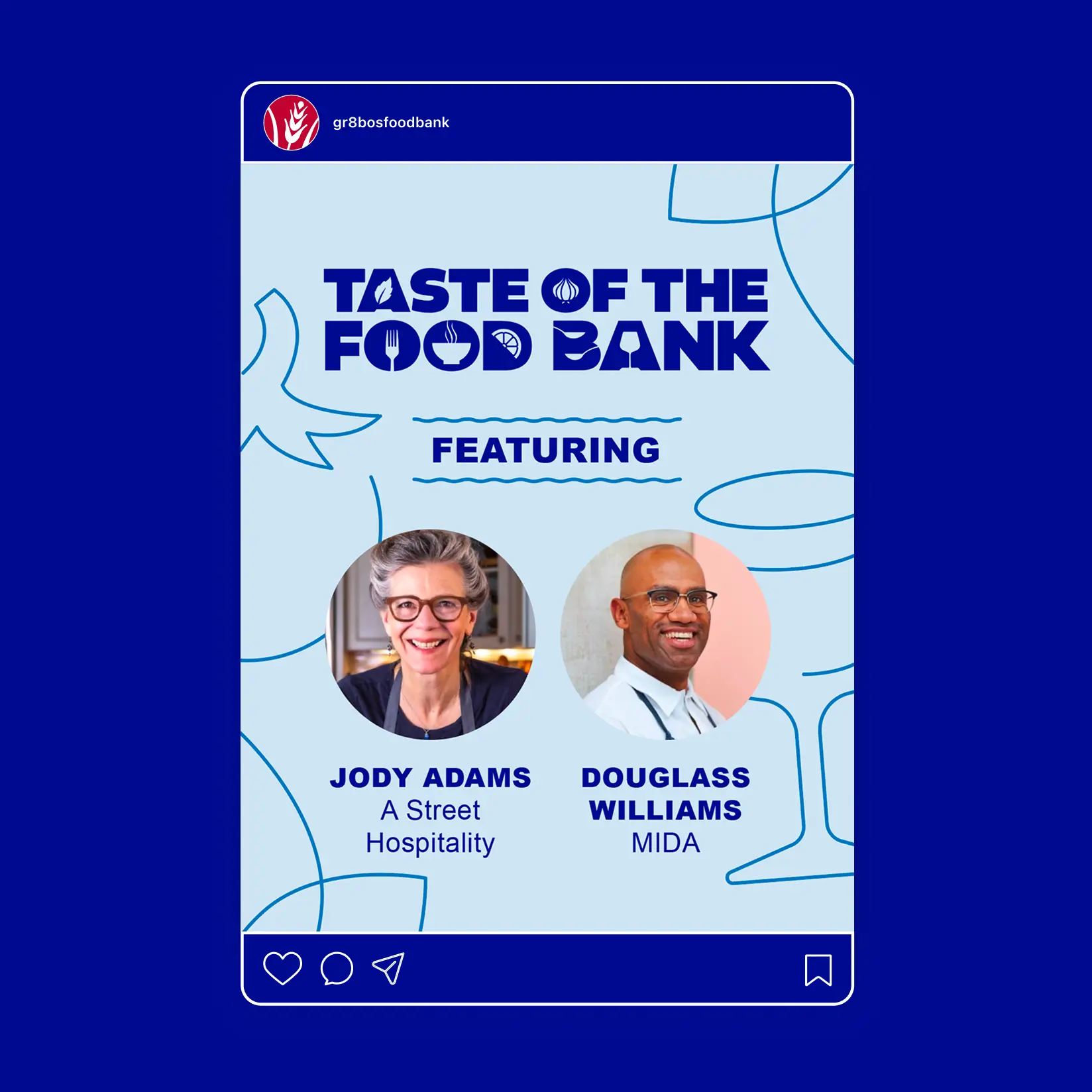
The event design in past years was approachable and slightly playful, which made sense for an event that’s more James Beard than Michelin. After a couple of iterations, we landed on a simple, slightly whimsical hand-drawn style for a feel that was both festive and unfussy. Other touches, such as squiggly underline elements and elevating vibrant parts of the color palette, made the event seem that much more inviting.
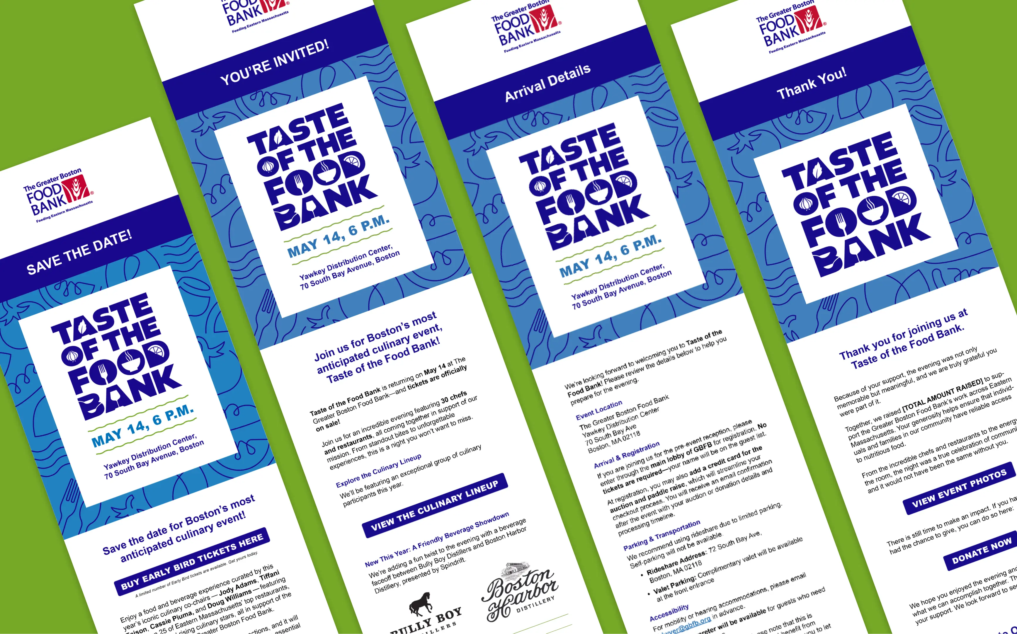

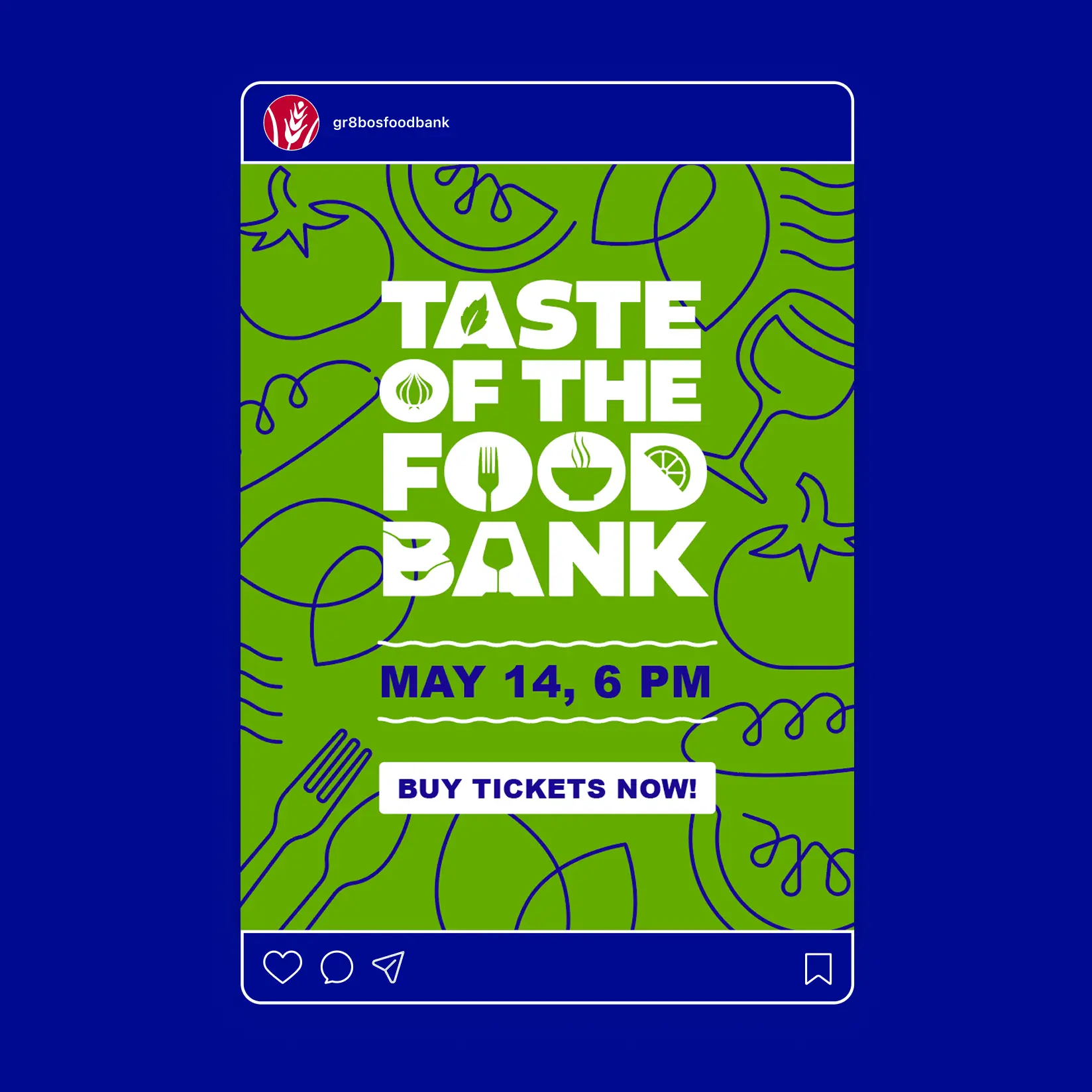
…All assets, that is. We brought the style to printed invites, social assets, wrist bands, signage, and yes, more. As we had hoped, the approach worked just as well on full-size posters as it did on pint-size social posts. Its presence on a suite of items created a cohesive look for an event that proved to be unforgettable and impactful.


Proud to be a certified women-owned business
Proud to be a certified women-owned business
Proud to be a certified women-owned business
