
Hillside Harvest is a Boston-based hot sauce company with Caribbean roots. They are focused on creating products that bring the heat with unique, fresh flavors such as Pineapple Fresno and Sun-Kissed Tomato. While Hillside was happy with their name and logo as it closely tied to their brand story, they were looking for support with evolving their brand’s look and feel, which was to be informed by a deep dive into brand strategy and positioning. Through a series of workshops, we were able to identify and articulate the true essence of the brand which leaned more heavily into the founder’s Caribbean heritage.
Branding
Infographics
Brand Strategy
Illustration
Product Packaging

The new Hillside brand includes colorful custom illustrations to clearly communicate the new positioning and jump off the shelf in a particularly crowded space. Each flavor has a unique pattern of ingredients, flora and fauna to evoke flavor, freshness, and fun — eliciting the feeling of the Caribbean. Because the illustrations are so colorful, we needed to set up a system for how each color in their elaborate palette would be applied to ensure consistency and a path for future flavor label development.


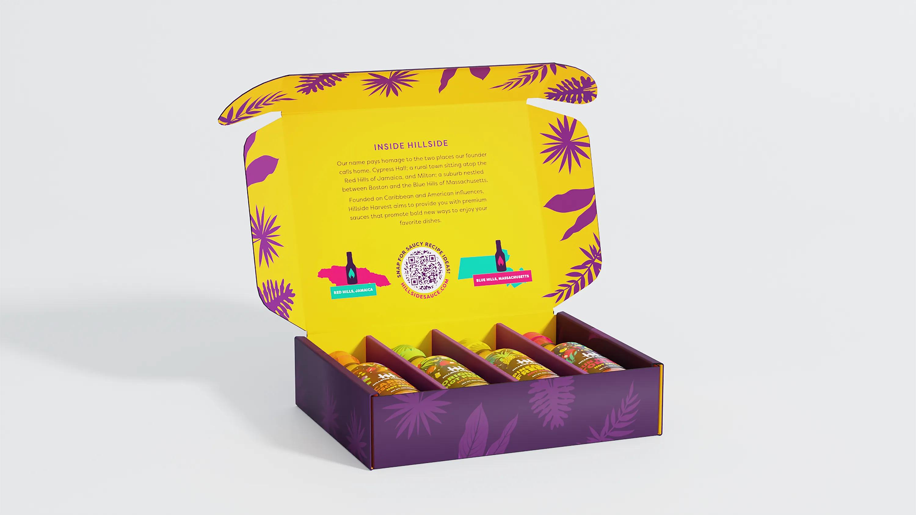
Once the labels were complete, we turned our attention to the e-commerce packaging. Each individual label includes a unique flavor visual, so this was an opportunity to bring multiple flavors and patterns together under the Hillside brand. The original Hillside brand used purple as a core color, which had significant meaning as a blend of blue and red in the brand story. We refined the specific shade of purple and then set to work bringing in all of the wonderful imagery from the bottles onto the box, creating a rainbow of color and texture that emits the essence of the Caribbean spirit we want the audience to feel.

Proud to be a certified women-owned business
Proud to be a certified women-owned business
Proud to be a certified women-owned business