
The Yang Tan Collective at MIT consists of six distinct centers dedicated to improving human health, all administered by the McGovern Institute for Brain Research, a long time client of ours.
When we began our partnership with McGovern, only one center existed under what is now known as the Collective, the Hock E. Tan and K. Lisa Yang Center for Autism Research. Over the course of our relationship, we have witnessed the Collective’s exponential growth with the addition of five more cutting-edge centers. We collaborated on the logo designs for four of these new centers and were most recently tasked with creating a cohesive and eye-catching master brand for the entire Collective.
Branding
Infographics
Reports & Publications
Website Design & Development

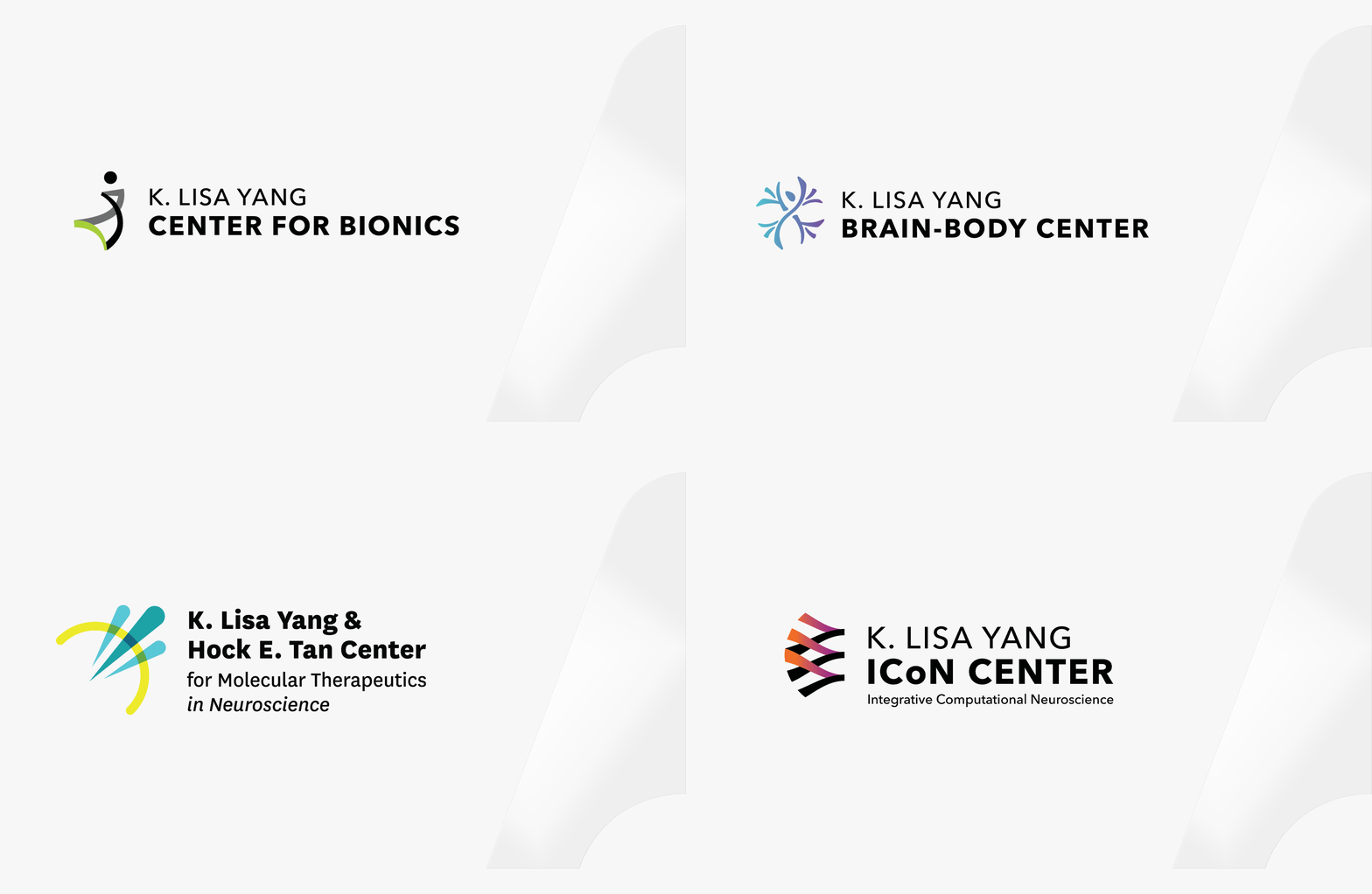
We worked closely with the client to craft logos for the Center for Molecular Therapeutics, the ICoN Center, the Center for Bionics, and the Brain-Body Center. Collaborating directly with the lead researchers of each center, we made sure the logos visually captured the important work they are doing. For the Center for Molecular Therapeutics, this meant depicting the precision with which they treat brain disorders using novel molecular tools. For the Brain-Body Center, it involved illustrating the interplay between the brain and body, creating a visual that merged a neuron with a human form.
When it came time to design the Collective’s logo, it was important for it to stand out from the individual center logos. Given all of the center logos are combination marks, we decided a wordmark with a custom twist in the letters would suit the Collective best. We stylized the A’s in “Yang Tan” as upward arrows to represent the momentum and exponential growth driven by the research within the Collective.
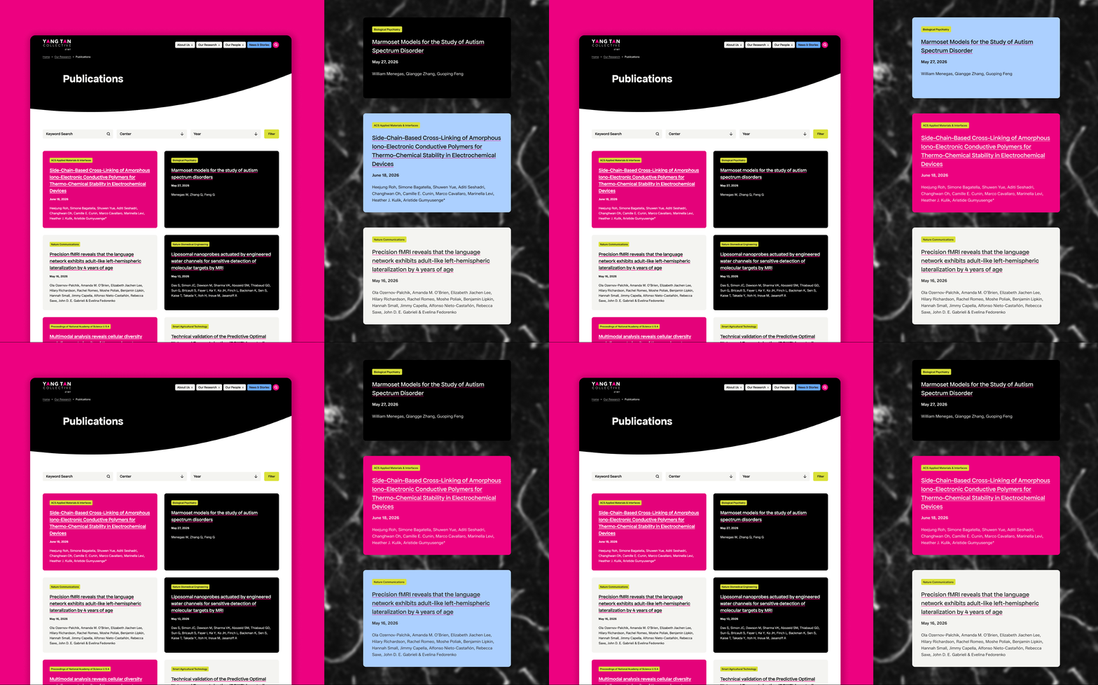
The Yang Tan Collective had grown considerably since we built their first website. With nine research centers now spanning MIT, Harvard, and Cambridge, they needed a site that reflected the scale and innovation of their work. The old site was small, lightly designed, and built for an organization still finding its footing. It was time for something that could keep up.
We started with a full discovery and analytics review to understand how people were using the existing site and where the gaps were. Working through that research, we identified goals, defined the new page templates, and established a clear design direction before any visual work began.
The brief was clear: the site needed to look and feel different. We designed a fully custom WordPress experience, anchored by a focused homepage that moves visitors quickly to the centers and surfaces stories about the important and innovative work. The clients were drawn to a dark background that lets their brand colors, particularly the pink, really pop. It also does something practical: the rich, colorful imagery from their research centers stands out in a way it couldn’t on a light background. We carried that attention to detail into the interactions too, incorporating a subtle nod to their logo mark as a quietly moving background element within the center popups as users navigate between centers on the homepage. Custom animations run throughout, purposeful and never distracting, giving the site energy without pulling attention away from the research.
The collective has alumni all over the world, but the old site had no real way to represent that. We built a system where admins can move someone from current fellow to alumni by entering a small amount of new information (location, current position), without recreating a profile from scratch. A custom interactive map makes the collective's global reach visible at a glance, showing how far the work extends beyond any single campus.

Rather than asking staff to manually maintain research listings, we integrated directly with PubMed and Google Scholar to automatically pull related publications into the site. Beyond that, we built in content automation wherever we could: content entered once surfaces in all the right places across the site, reducing redundant work for the admin team and keeping everything consistent.
The result is an interactive, visually distinctive experience that doesn't ask a lot of the people maintaining it. The design has presence without being overbuilt, and the CMS is set up so the team can keep things current without needing a developer for everyday tasks.
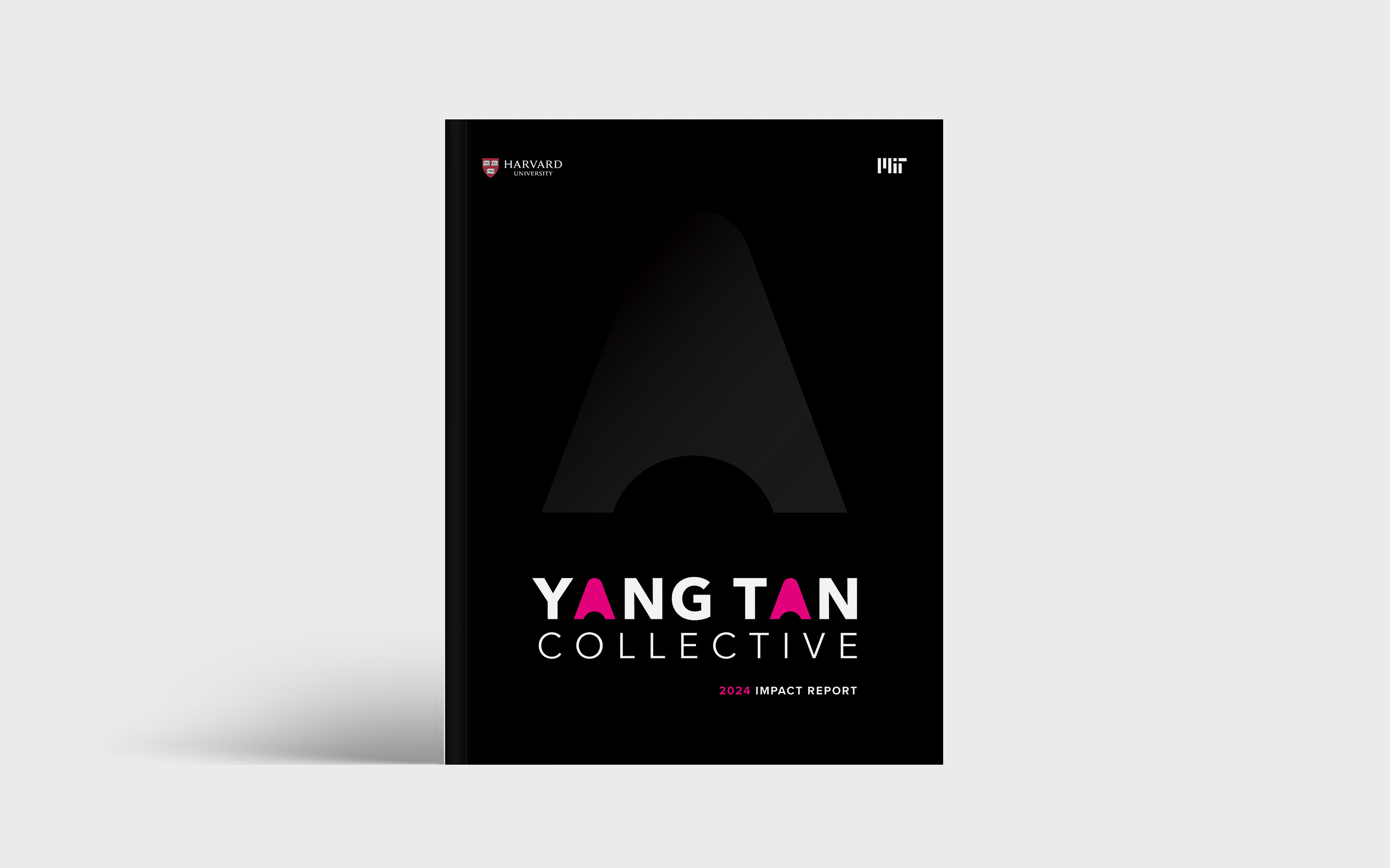
To showcase the groundbreaking research and technologies within the Collective over the past year, we collaborated with them to compile stories from all six centers into a comprehensive impact report for donors. This report highlights not only the research and top discoveries of the year but also includes a profile of a researcher from each center.
To create a cohesive design, we utilized each center's color palette within their respective sections and applied the Collective’s master branding for the cover and introduction. This approach allowed readers to feel immersed in each center’s section without any sense of disjointedness. The cover, bold and high-contrast in design, features an oversized arrow from their logo applied in a clear foil, adding a dynamic element.


Proud to be a certified women-owned business
Proud to be a certified women-owned business
Proud to be a certified women-owned business
