The founder of Kensa Inspections came to us with a dream to start a new kind of home inspection business — one that embraced the possibility of sincere collaboration between home inspector, home buyer, and real estate agents. He also recognized that his role was bigger than inspecting electric boxes and plumbing; he was helping folks make an informed decision at one of the most major milestones in their life — buying a home.
Branding
Infographics
Marketing Materials
Website Design & Development
Naming
Brand Strategy
Logo Design
Visual Identity
Promotional Material
Presentation Design
Digital Marketing Graphics
CMYK: 42, 10, 89, 0
RGB: 161, 189, 80
HEX: #A1BD50
CMYK: 0, 64, 88, 0
RGB: 255, 124, 49
HEX: #FF7C31
CMYK: 27, 91, 81, 24
RGB: 150, 49, 49
HEX: #963131
CMYK: 87, 33, 63, 16
RGB: 14, 118, 103
HEX: #0E7667
CMYK: 83, 52, 57, 34
RGB: 41, 81, 83
HEX: #295153

Since collaboration and inclusivity are so important to Kensa, we took inspiration from cultures all around the world to identify several possible names before testing the most successful names with target audiences. The final name, Kensa, has many meanings across the world that speak to the essence of the brand — from the literal “inspection” translation in Japanese to the combination of the founder’s name “Ken” and “sa” which means protection in ancient hieroglyphics.

As part of establishing a comprehensive visual identity, we created a distinctive, memorable logo. The vibrant colors balance the brand’s colorful personality and professional practices. The fonts are rounded and approachable, which was important to convey the collaboration which is central to the brand. The teardrop shape above the “K” can be read as the head on a person, reaffirming the humanity of Kensa, or also as a comment bubble to give nod to the inspection process.


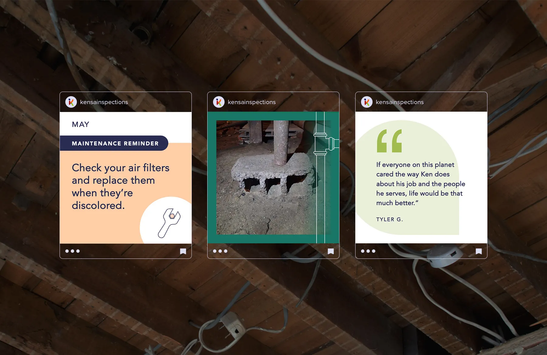
Social media is an important driver for building brand awareness and staying top of mind with local realtors. We worked with them to create a LinkedIn page and personal banners, profile icons, and custom social templates. We built easy-to-use templates for fast and simple editing. The templates are versatile enough for use across multiple platforms and to address multiple content needs to ensure a consistent and professional branded online presence.


We worked closely with Kensa to understand the waters in which they swim before diving into website design and copywriting. We conducted several interviews with target audience members to determine key points of difference that they most cared about. We researched competitors to benchmark all the types of content users might need and to identify how Kensa could stand out from the crowd. And, we facilitated a thoughtful brand strategy exploration to set clear guidelines for look and feel for design and voice and tone for writing.
This website, which we custom built using the Webflow content management system, embodies the personality of the brand in several different ways. The non-conventional primary navigation, the uplifting illustration style, and the simple and easy to navigate content, all connect to the critical attributes of the brand.
